Why Wet-on-Wet Watercolor is Part of the Curriculum
by Angelika DiPasquali, Lotus & Ivy Teacher
"The goal is to balance colors corresponding to a feeling of inner well-being"
Children in Waldorf (Rudolf Steiner) schools are fortunate recipients of a rich curriculum which enlivens and strengthens their emerging capacities for thinking, feeling and willing. Painting throughout the elementary school years enhances the healthy manifestation of these faculties as well as the child’s social relationships.

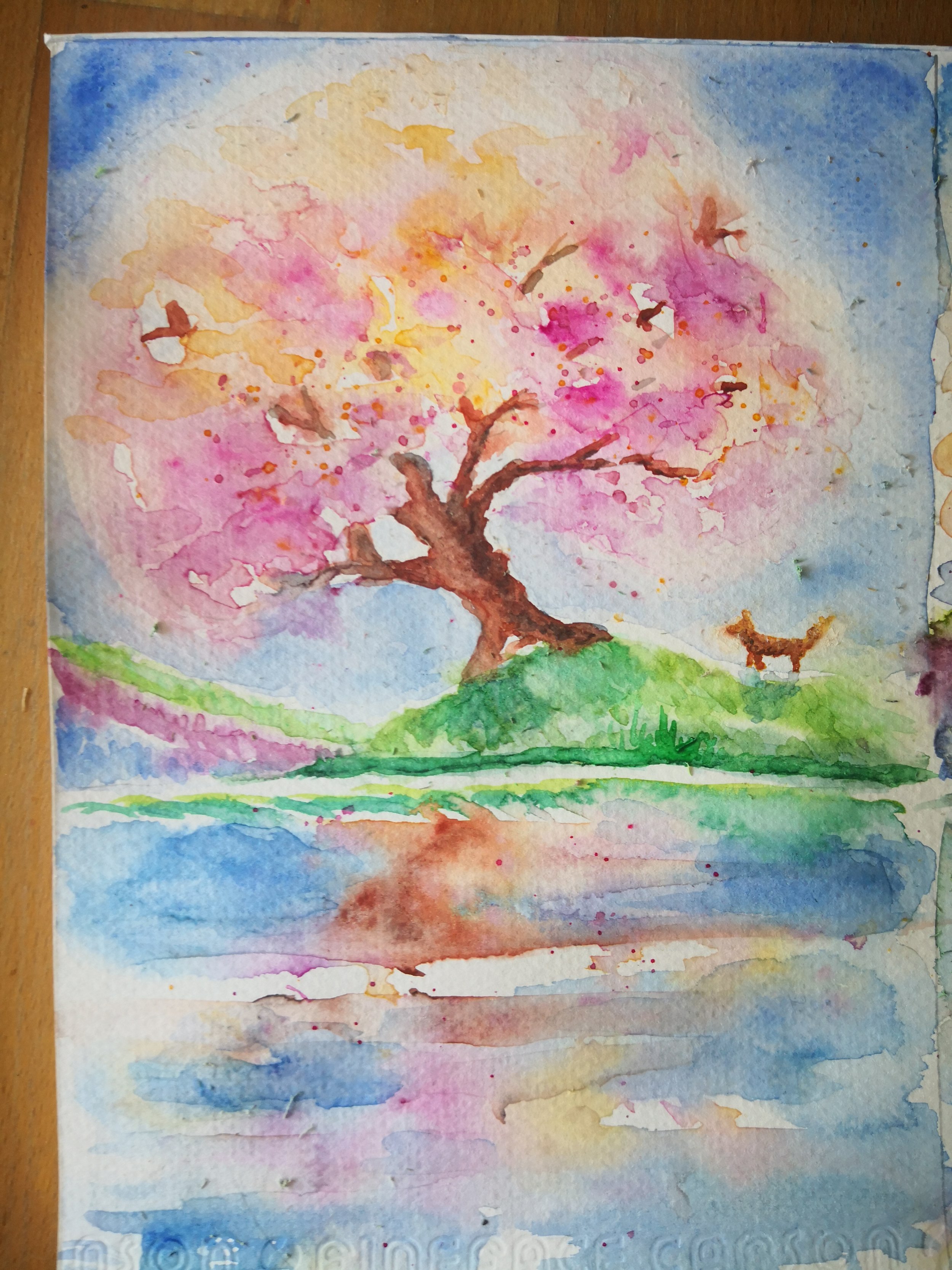
In Waldorf schools, especially in lower grades, watercolor paint is applied to wet, soaked paper. This method creates beautiful blending and teaches children the basic principles of color theory in an organic, hands-on way. To describe a way of creating with color is not easy without showing actual examples, since the painting process is a visual experience. One needs to experiment for oneself, repeating exercises many times over, striving for a new kind of feeling-perception.
Then, for the teacher, the challenge is to imaginatively present color exercises to the children in a manner suitable for each age. Only a bare indication of how this may be accomplished can be given here. The goal is to balance colors corresponding to a feeling of inner well-being. To achieve such a balance one must develop a specific awareness, as one does in other art forms. In form drawing, for instance, the children take care to guide the crayon so that they may achieve harmony of space and symmetry. Playing a stringed instrument, they learn how to hold their bow and to listen for the correct pitch. Similar care and dedication to principles of beauty and lawfulness are necessary when painting with watercolors.
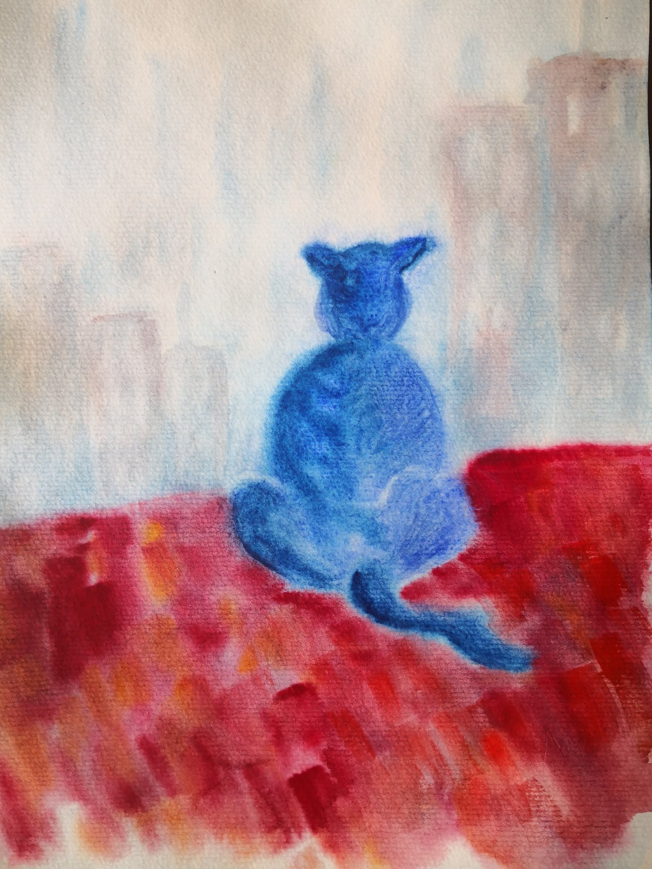
The child explores color through his feeling life. How far does the lively, joyous yellow wish to radiate into the surrounding white? How happily and safely protected it feels when surrounded by blue, if their meeting leads to a delicate merging of each, producing a third color, green, which is not dense or heavy, but more like a gentle bridge between its two “friends”. Or, in a different exercise, one might begin with green (pre-mixed) as the first step taken by the colors in “building a house”. The green lays itself down evenly across the bottom to be the floor of the house, measured in an amount suitable to the page as a whole. The bright, active red comes to its rightful place, sitting in the middle on the green floor while also arching above to form the walls and roof! Now yellow and blue contribute their part. And what do they offer their two friends and each other in this story? The teacher’s task will be to embody the conversations of the colors with each other in a language felt and understood by the children.

The Waldorf curriculum contains a wide range of themes which can be transposed so as to re-emerge as color motifs. Another aspect of painting with children deserving attention is the selection of colors the teacher makes available to the children. Naturally, the pure colors, in that they give clear expression to the essential will nature of each color, are to be painted first. When these colors meet and interpenetrate, the mixed colors are born. It then becomes appropriate to paint with colors such as green, orange, violet, and even brown, in their various shades and gradations. These colors all appear in the natural world. There is lawfulness, for example, in the fact that green (as well as brown) is a firm enough color on which to stand. It belongs under our feet and feels “right” painted at the bottom of the page when starting a painting exercise with this color. As the picture develops, and colors merge with each other, green may nonetheless arise elsewhere, as a more “atmospheric” color.

In preparing the painting lesson, the teacher may ask what “color mood” the motif suggests. As Rudolf Steiner indicated, we can instruct the children to tone their whole paper with a pale wash of a color on which the other colors are to be painted. For instance, a light warm yellow might set the mood for a lion to arise. On the other hand, first toning the paper a pale blue might be just the right mood for painting the eagle. Then, the colors of the animal, the ground beneath it and the vegetation are all to be chosen with care as well.

One can establish a mood by means of colored washes when coming to such motifs as sunrise and sunset, the life of plants through the various seasons, as well as in connection with stories. A particular color mood may come to mind when contemplating, for example, the Old Testament story of Moses and the burning bush and quite another for let us say, an Eskimo tale.
Essential to this approach is the question of balancing of one color against another. Rudolf Steiner initiated a new qualitative color balancing principle. To qualitatively ‘measure’ colors to each other in this way strengthens capacities of observation and empathy. Whereas green can have a certain weight as “image” color, yellow (a “luster” color) is by its very nature completely weightless. Thus we would feel a contradiction in beginning a picture by painting green across the top of the empty white page. The bottom of the page will seem its natural and right place. As the painting develops, we sense a clear need to establish balance in terms of above, below, right and left.
However, the essential key is that the quantity, strength and placement of colors depend on the answer one color gives another as they strive for harmonious balance. We must therefore “listen” to the colors. A social relation between the colors is striven for, just as the children are encouraged to take account of each other’s needs and feelings.
When guiding children’s experience of true balance and harmony of colors, it is important that they are able to stand vis-a-vis their painting (rather than sit) and view it frontally. For this purpose, painting boards can be propped on simple, small table easels, as soon as the children are able to manage their materials. Good quality soft, natural hair brushes, quality absorbent paper and fine watercolors go a long way in making for a satisfying painting experience.
About Angelika Di Pasquali
Angelika Di Pasquali was born and raised in Germany and lived in Germany until 1992. She holds two citizenships, German and Italian, and has spent many years living in Italy. She graduated as a Waldorf teacher in Mannheim, Germany, and begin her teaching career in Italy in 1992. She taught grades 3, 4, and 5 and, after that, took on with another class in grades 5, 6, 7, and 8 as their class teacher.
After this, she taught exclusively German in a private High School in Bolzano for over 10 years and gave classes for all levels, including adult classes in the evening in a training center. At the same time, she studied modern languages at the University of Trento, Italy and became an examiner for the international Goehte Institut, which releases certificates for German studies.
From 2015 until 2018 she was the German teacher in the Spring Valley Waldorf School in Beijing, China and also gave lessons in the teacher training center of Spring Valley for Movement, Rhythms and Bothmer. In the year 2019, she was the leader of a summer camp for the Worldwide Waldorf Sommercamps in Yunnan, China. Angelika teaches German and Watercolor Painting to Lotus & Ivy students.
Angelika’s greatest passions are watercolor painting and traveling. She loves teaching children around the world online at Lotus & Ivy.